Member-only story
The Ultimate Guide To CSS Grid
During the last two months I’ve been taking a deeper look into CSS Grid. In this tutorial I want to share the key findings. To make things easier, I explained them using visual diagrams.
Here’s a list of my best web development tutorials.
Complete CSS flex tutorial on Hashnode.
Ultimate CSS grid tutorial on Hashnode.
Higher-order functions .map, .filter & .reduce on Hashnode.
You can follow me on Twitter to get tutorials, JavaScript tips, etc.
To get a good idea of how flex works try flex layout editor on this page.
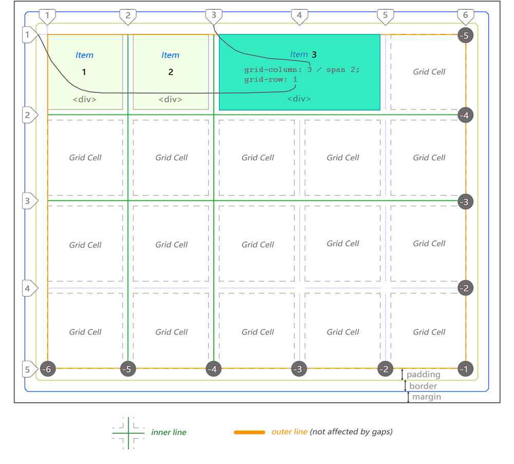
You are probably already familiar with CSS box model for regular elements. Let’s begin with a similar “bird’s eye view” representation for the CSS Grid:

In this case there are 3 <div> items. Third one is stretched across 2 cells.
Notice lines can be counted backwards too using negative coordinate system.
The grid above is 5 by 4 cells in dimension. It is defined as follows:
div#grid {               /* This is our CSS grid parent container */
  display: grid;
  grid-template-columns: 100px 100px 100px 100px 100px; /* 5 cols */
  grid-template-rows:    100px 100px 100px 100px;       /* 4 rows */
}
Number of rows and columns is assumed implicitly by number of values set.
In between each cell there is a line and an optional gap.
Rows and columns between the lines are referred to as grid’s tracks.
There are always [cell + 1] lines per dimension.
Therefore 5 columns will have 6 lines whereas 4 rows will have 5 lines.
In the following example there are 7 columns and only 1 row:
