Member-only story
The Ultimate Guide To CSS Grid
You can follow me on Twitter where I post my Medium tutorials.
Here’s a list of my best web development tutorials.
Complete CSS flex tutorial on Hashnode.
Ultimate CSS grid tutorial on Hashnode.
Higher-order functions .map, .filter & .reduce on Hashnode.
Follow me @ Twitter, Instagram & fb to never miss premium articles.
https://jstutorial.medium.com/my-coding-books-4f4dd2c35dd3
You’re probably familiar with the box model for regular elements.
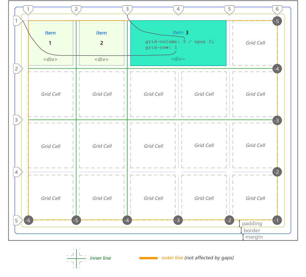
Here’s bird’s eye view for the CSS Grid model:

In this case there are 3 <div> items. Third one is stretched across 2 cells.
Notice lines can be counted backwards too using negative coordinate system.
The grid above is 5 by 4 cells in dimension. It is defined as follows:
div#grid {               /* This is our CSS grid parent container */
  display: grid;
  grid-template-columns: 100px 100px 100px 100px 100px; /* 5 cols */
  grid-template-rows:    100px 100px 100px 100px;       /* 4 rows */
}
Number of rows and columns is assumed implicitly by number of values set.
In between each cell there is a line and an optional gap.
Rows and columns between the lines are referred to as grid’s tracks.
There are always [cell + 1] lines per dimension.
Therefore 5 columns will have 6 lines whereas 4 rows will have 5 lines.
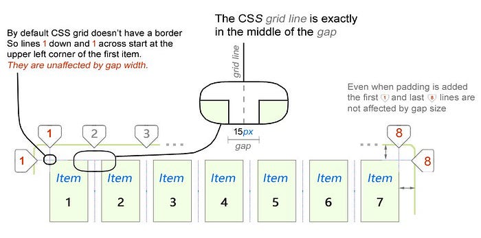
In the following example there are 7 columns and only 1 row:

The first important thing you will notice about CSS grid is that outer lines are not affected by gap size. Only inner lines. We will take a deeper dive into this a bit later in this tutorial when we look at fractional (fr) units.
The CSS grid is bi-directional. Its items can flow either horizontally (column) or vertically (row). Set the value with grid-auto-flow property.
